
Audigy Re-Brand



Project Overview
Audigy is a national organization supporting independent audiology practices across the U.S. After years of visual fragmentation, outdated templates, and unclear brand usage, we knew it was time for a full-scale rebrand.
My Roles:
Creative Director, Brand Strategist, Lead Designer
I helped lead the creation and rollout of a new identity system — one that brought clarity, consistency, and heart to the way Audigy shows up at every level: corporate, member-facing, and internal.
The Challenge
Over time, the Audigy brand had become visually fragmented and inconsistent across departments and materials. As the organization grew, brand guidelines were outdated, misunderstood, or ignored altogether.
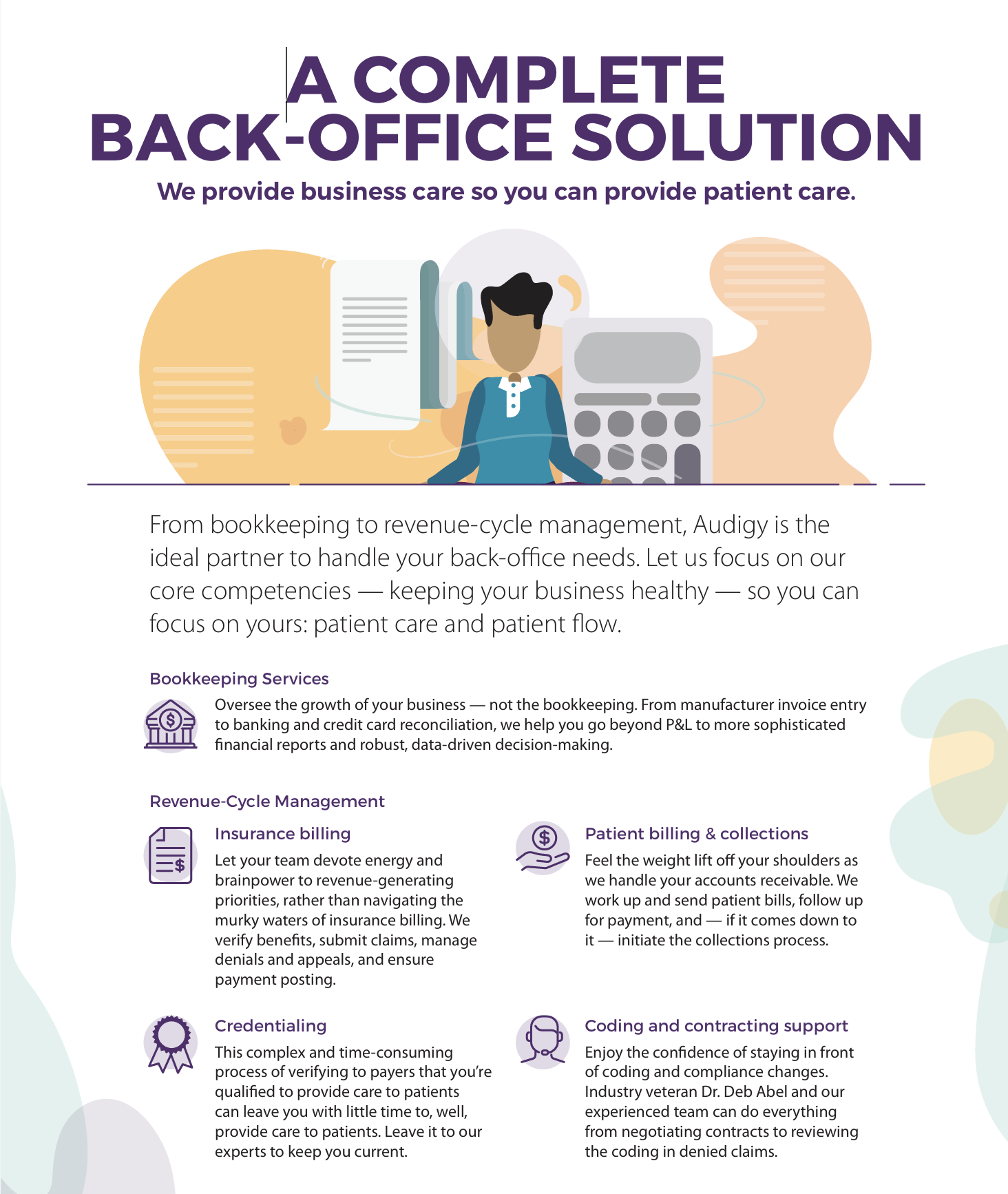
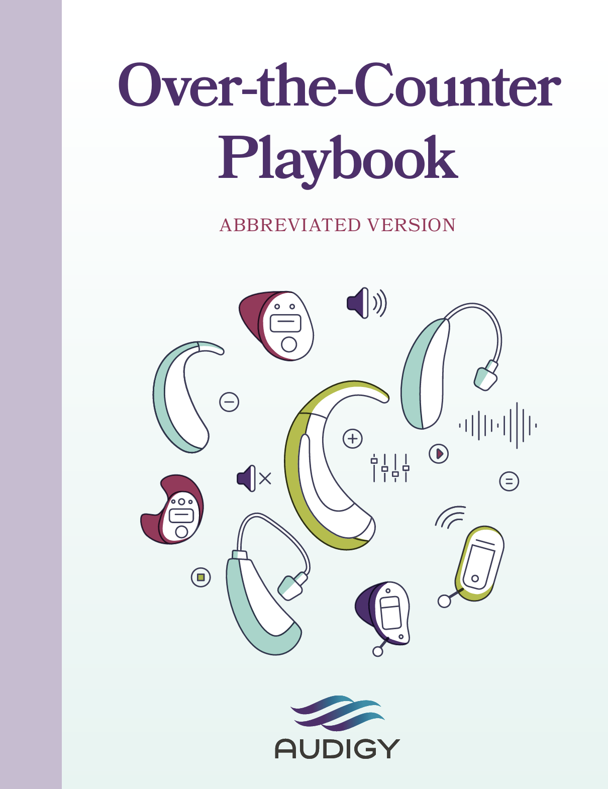
A recent re-brand (several years ago) had provided an attempt to update and align the Audigy brand. But it was out of step with the tone and needs of the Audigy brand and it’s membership. And due to it’s highly illustrative/organic nature — and lack of systematic support for the branding — it was difficult to implement in the day to day of various departments outside of creative team support.
The Approach
We started with the brand’s emotional core: Audigy’s mission to help independent practices grow while staying true to their values. We worked initially with a consulting agency to re-brand, but the executive team and senior leadership were generally unhappy with the final outcome.
I was asked to lead an internal version of the rebrand. I worked with stakeholders across departments to identify what felt essential and what needed to evolve.
From there, I led the creation of:
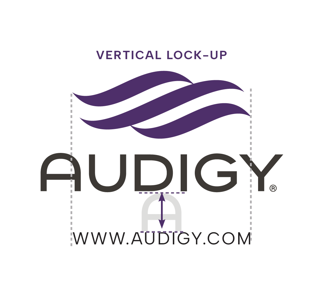
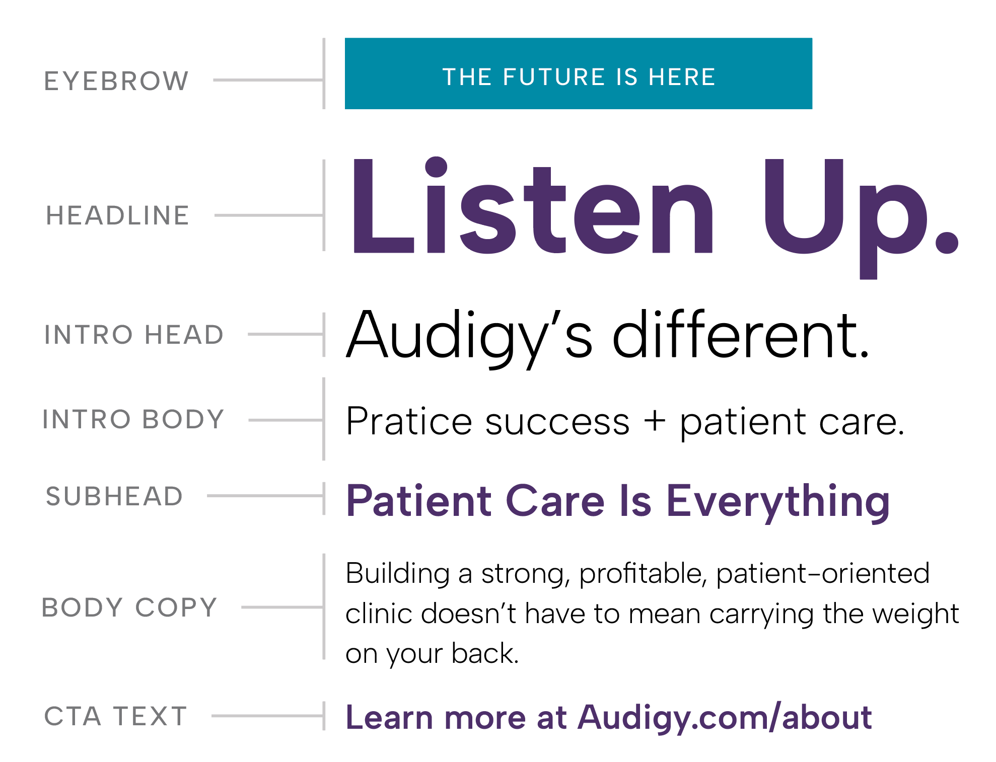
An revamped comprehensive style guide
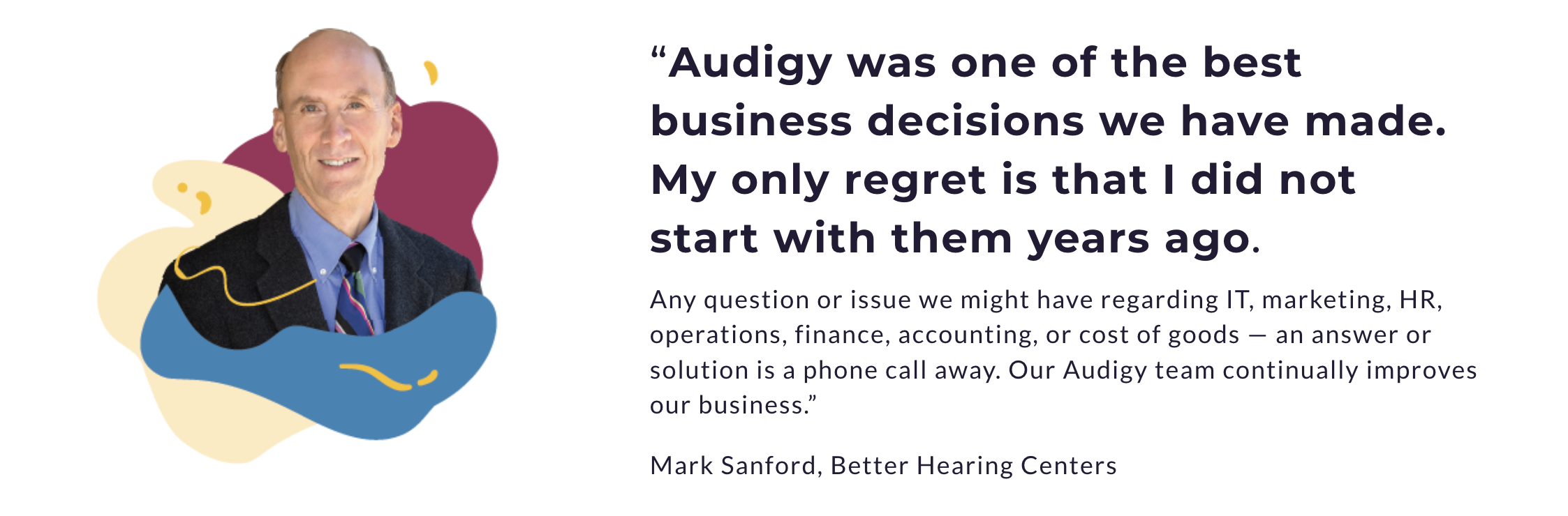
Emphasis on the human element of the brand, real human connection, real people in photos
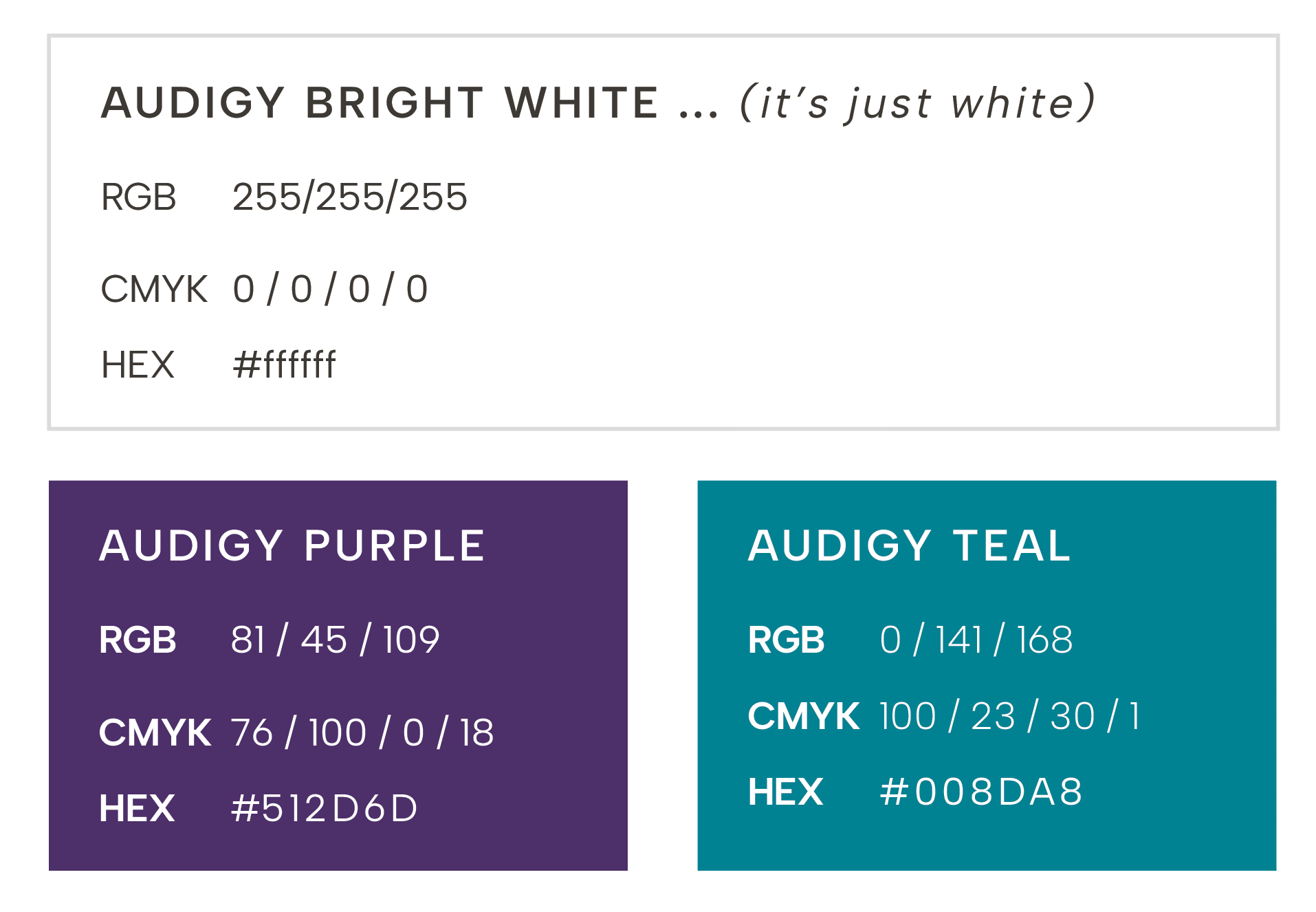
A scalable color and typography palette
Guidelines for icon, photography, and brand element use
Branded templates, photo and icon libraries, and quick guides to lower the barrier to brand consistency outside of our creative department
Partnered with our internal corporate teams to roll-out the updated brand and help ensure alignment after the roll-out
Throughout, the goal was to ensure that every touchpoint reflected Audigy’s dedication to changing lives, partnership, and practice success.
The Outcome
The rebrand resulted in a clear, usable identity system (eagerly) embraced across departments. And our members began seeing marketing materials from us that felt both more professional and demonstrated the powerful purpose at Audigy’s core.
Through this transformation, Audigy finally began to feel like a single, unified brand — one that respected its audience, empowered its people, and more clearly communicated the people-first ethos under the hood.
Additionally, for myself, it hit home just how important getting a brand’s emotional alignment right was. For the the brand itself. For the audience. But also for the people working to represent the brand. There was a clear sense of pride on the other side of the re-brand, as people felt their own emotional attachment to Audigy recognized in the update.
And of course, the cadre of excellent and eager collaborators and partners that I had the distinct honor to work alongside throughout this process had an immense impact in the successful outcome.